
ไฟล์:Suckale08 fig3 glucose insulin day.jpg
Suckale08_fig3_glucose_insulin_day.jpg (800 × 600 พิกเซล, ขนาดไฟล์: 60 กิโลไบต์, ชนิดไมม์: image/jpeg)
| รูปภาพหรือไฟล์เสียงนี้ ต้นฉบับอยู่ที่ คอมมอนส์ รายละเอียดด้านล่าง เป็นข้อความที่แสดงผลจาก ไฟล์ต้นฉบับในคอมมอนส์
|
ความย่อ
| คำอธิบาย |
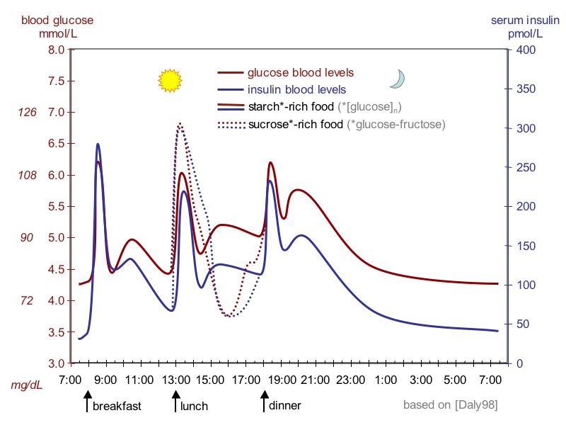
English: idealized curves of human blood glucose and insulin concentrations during the course of a day containing three meals; in addition, effect of sugar-rich meal is highlighted;
Ελληνικά: Ιδανική καμπύλη διακύμανσης γλυκόζης και ινσουλίνης στον άνθρωπο κατά τη διάρκεια μιας ημέρας που περιέχει τρία γεύματα. Επιπλέον, επισημαίνεται η επίδραση του γεύματος πλούσιο σε ζάχαρη (γραμμές με τελίτσες). Μεταφρ. εικ. breakfast=πρωϊνό, lunch=μεσημεριανό, dinner=βραδινό, glucose blood levels=επίπεδα γλυκόζης αίματος, insulin blood levels=επίπεδα γλυκόζης αίματος, starch-rich food=φαγητό προύσιο σε άμυλο, sucrose-rich food=φαγητό πλούσιο σε σάκχαρα. Επεξήγηση εικόνας: Κάτω οριζόντια είναι οι ώρες της ημέρας. Αριστερά κάθετα έχουμε τις μετρήσεις σε mmol/L και σε mg/L. Η κόκκινη γραμμή είναι η διακύμανση της γλυκόζης και η μπλε της ινσουλίνης. Η διακεκομμένη γραμμή είναι η περίπτωση μεσημεριανού πλούσιου σε ζάχαρη. Τα μέγιστα της γλυκόζης είναι μετά τα γεύματα και ανέρχονται στα 6,25 mmol/L ή 113 mg/L. Τα ελάχιστα είναι μερικές ώρες μετά τα γεύματα και κατέρχονται στα 4,5 mmol/L ή 81 mg/L. Όταν το γεύμα είναι πλούσιο σε ζάχαρη έχουμε λίγο μεγαλύτερη άνοδο της γλυκόζης αλλά και μεγαλύτερη κάθοδο γιατί παράγεται περισσότερη ινσουλίνη. |
| วันที่ | |
| แหล่งที่มา | Solimena Lab and Review Suckale Solimena 2008 Frontiers in Bioscience PMID 18508724, preprint PDF from Nature Precedings, original data: Daly et al. 1998 PMID 9625092 |
| ผู้สร้างสรรค์ | Jakob Suckale, Michele Solimena |
| เวอร์ชันอื่น |
ไฟล์อื่นที่ใช้ไฟล์นี้:
Suckale08 fig3 glucose insulin day BG-language tags.jpg  |
Making of the diagram
The figure is based on the research by Mark Daly and colleagues working in the University of Newcastle, UK. The study was published 1998 in the peer reviewed American Journal of Clinical Nutrition. Take a look at the original article on the web. Figure 2 (blood glucose) and figure 3 (serum insulin) were combined into the graphic above. The whiskers for standard error of the mean and some intermediate data points were omitted to make the diagram easier to read. The highest and lowest points have been copied accurately from the research paper. Points were then connected with a curve instead of the straight lines used in the paper. The study is based on 8 test persons, which means that for a different sample, the values could be slightly higher or lower but probably within the standard errors given in the paper (errors are 0.1-0.3 mM for glucose and 10-60 pmol/L for insulin).
PNG version
A PNG version of this JPEG file has also been uploaded to the commons:
http://en.wikipedia.org/wiki/File:Suckale08_fig3_glucose_insulin_day.png
การอนุญาตใช้สิทธิ
- คุณสามารถ:
- ที่จะแบ่งปัน – ที่จะทำสำเนา แจกจ่าย และส่งงานดังกล่าวต่อไป
- ที่จะเรียบเรียงใหม่ – ที่จะดัดแปลงงานดังกล่าว
- ภายใต้เงื่อนไขต่อไปนี้:
- แสดงที่มา – คุณต้องให้เกียรติเจ้าของงานอย่างเหมาะสม โดยเพิ่มลิงก์ไปยังสัญญาอนุญาต และระบุหากมีการเปลี่ยนแปลง คุณอาจทำเช่นนี้ได้ในรูปแบบใดก็ได้ตามควร แต่ต้องไม่ใช่ในลักษณะที่แนะว่าผู้ให้อนุญาตสนับสนุนคุณหรือการใช้งานของคุณ
- อนุญาตแบบเดียวกัน – หากคุณดัดแปลง เปลี่ยนรูป หรือต่อเติมงานนี้ คุณต้องใช้สัญญาอนุญาตแบบเดียวกันหรือแบบที่เหมือนกับสัญญาอนุญาตที่ใช้กับงานนี้เท่านั้น

|
ภาพกราฟนี้ ควรจะถูกสร้างใหม่เป็นกราฟิกส์เวกเตอร์ ซึ่งมีข้อดีอีกหลายประการ ดูเพิ่มเติมที่คอมมอนส์:สื่อต้องการเก็บกวาดสำหรับสารสนเทศเพิ่มเติม หากภาพนี้มีในรูปแบบกราฟิกส์เวกเตอร์อยู่แล้ว กรุณาอัปโหลดและแทนที่แม่แบบนี้ด้วย
{{vector version available|ชื่อภาพใหม่}}
แนะนำเป็นอย่างยิ่งให้ตั้งชื่อไฟล์เวกเตอร์ใหม่นั้นในรูปแบบ "Suckale08 fig3 glucose insulin day.svg" แล้วใส่แม่แบบ Vector version available (หรือ Vva) ซึ่งไม่ต้องใช้พารามิเตอร์ ชื่อภาพใหม่ |


ประวัติไฟล์
คลิกวันที่/เวลาเพื่อดูไฟล์ที่ปรากฏในขณะนั้น
| วันที่/เวลา | รูปย่อ | ขนาด | ผู้ใช้ | ความเห็น | |
|---|---|---|---|---|---|
| ปัจจุบัน | 21:09, 17 สิงหาคม 2552 | | 800 × 600 (60 กิโลไบต์) | Jakob Suckale | * axes have been labelled more clearly * the conventional (mg/dl) in addition to the standard unit (mmol/L) has been added for blood glucose |
| 21:10, 25 มิถุนายน 2551 |  | 945 × 731 (148 กิโลไบต์) | Jasu | {{Information |Description={{en|1=idealised curves of human blood glucose and insulin concentrations during the course of a day containing three meals; in addition, effect of sugar-rich meal is highlighted;}} |Source=Solimena Lab and Review Suckale Solime |
หน้าที่มีภาพนี้
หน้าต่อไปนี้ โยงมาที่ภาพนี้:
การใช้ไฟล์ข้ามโครงการ
วิกิอื่นต่อไปนี้ใช้ไฟล์นี้:
- การใช้บน ar.wikipedia.org
- การใช้บน el.wikipedia.org
- การใช้บน en.wikipedia.org
- การใช้บน en.wikibooks.org
- การใช้บน en.wikiversity.org
- การใช้บน fr.wiktionary.org
- การใช้บน hi.wikipedia.org
- การใช้บน kn.wikipedia.org
- การใช้บน ml.wikipedia.org
- การใช้บน pt.wikipedia.org
- การใช้บน sh.wikipedia.org
- การใช้บน sr.wikipedia.org
- การใช้บน ta.wikipedia.org
- การใช้บน zh-min-nan.wikipedia.org
- การใช้บน zh.wikipedia.org